Design Systems
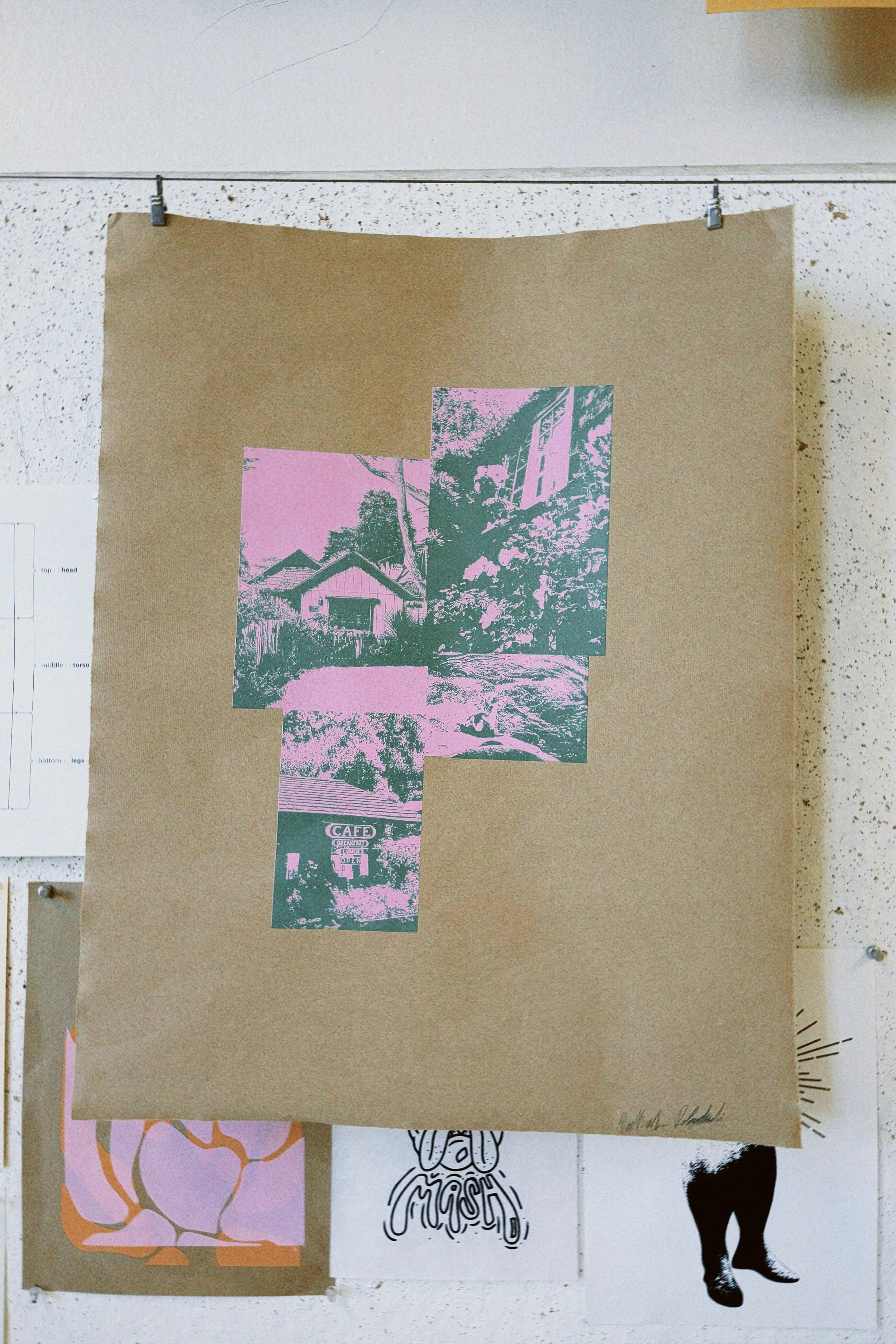
For this project, I aimed to create a cohesive design that could be printed across three substrates. When deciding which direction to take for my design, I opted to use photos I had taken while on a trip to NorCal over the Summer of ‘25, making them the focal point of my design instead of relying on hand-drawn illustrations.
Design Brief
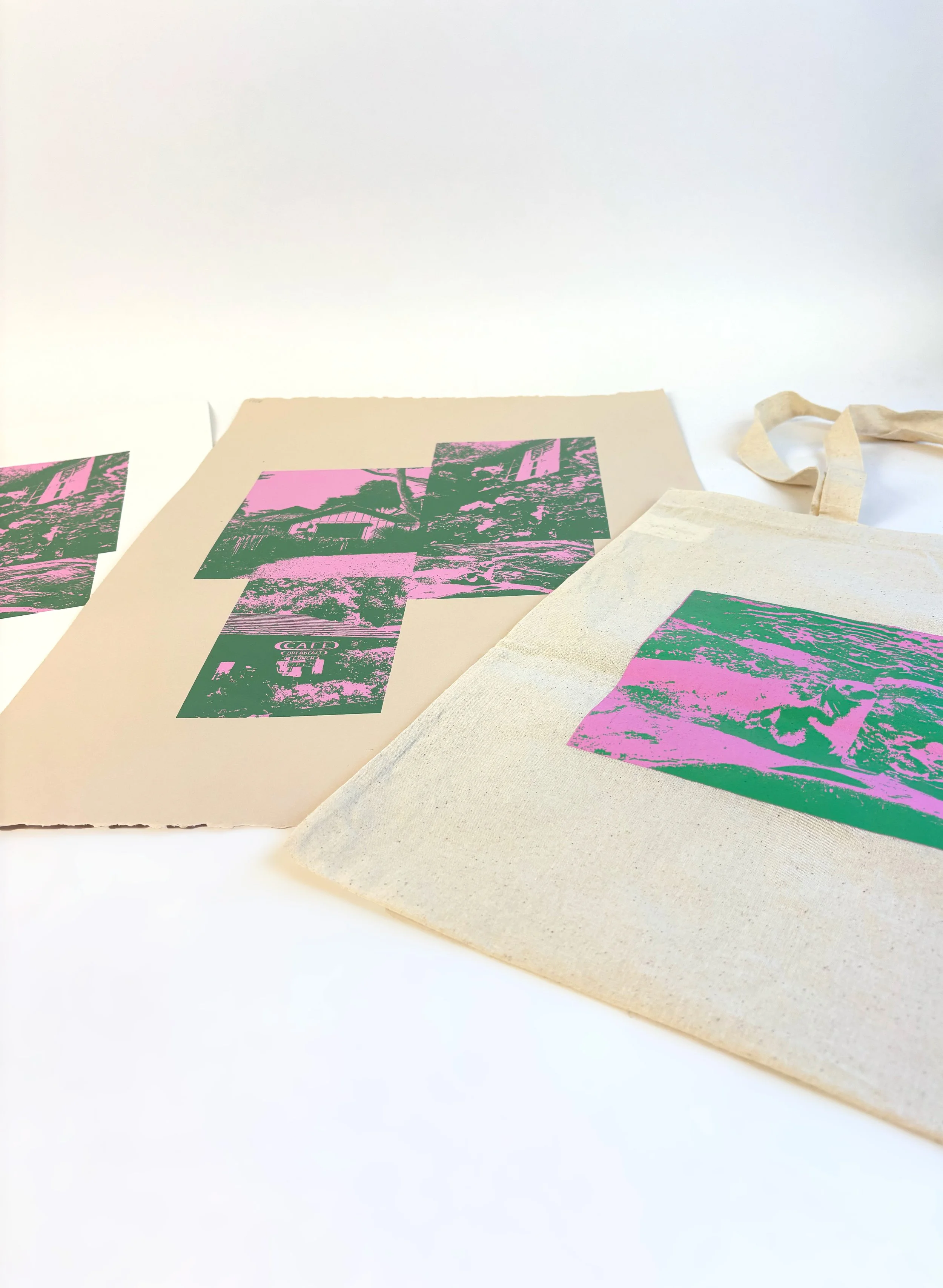


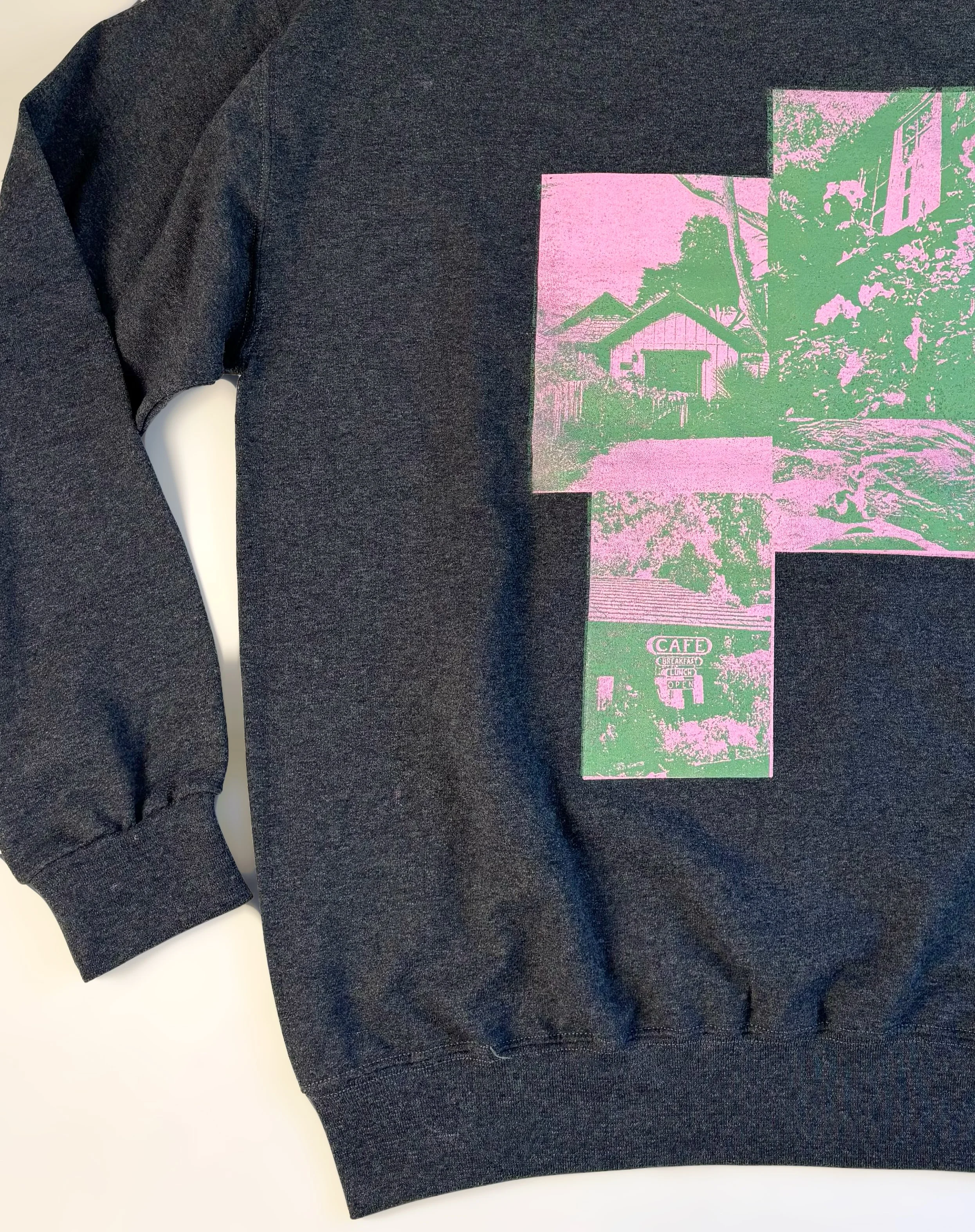
When translating the photos from my screen to the mesh, the best way to keep the details of the nature scenes and make the printing process as simple as possible I transformed them. First, I edited them in Photoshop to create flat threshold designs. Then, I placed a color block behind the thresholds to capture more of the details in the scenes.
When printing my work, I used two screens. The first screen I used to print was the solid pink background. After flooding the screen and pushing the ink through the mesh onto each substrate, I placed the flash heater over the work to quickly dry the first pink layer. Following the heater, I would flood my second screen, which possessed the threshold layer, with green ink using a squeegee, then print the second layer of my design.
Process
Final Design
The three substrates I used were four tote bags, four posters, and two sweatshirts. While the posters were pretty straightforward to print, printing on the cloth materials was difficult, especially when ensuring the layers aligned perfectly. When printing on the totes and sweatshirts, I had a hard time making sure the substrate stuck to the palette rather than the screen, which resulted in designs that were not perfectly aligned or printed. Overall, I believe I was able to create a cohesive design.
