Bloom
Design Brief

For this assignment, I was asked to redesign a small UI for either a pregnancy test, a compression nebulizer, or a blood pressure monitor. The goal of this assignment was to create a user interface while balancing the usability alongside the constraints of the hand held devices to create a cohesive and usable, working design.

User Personas
Design Process
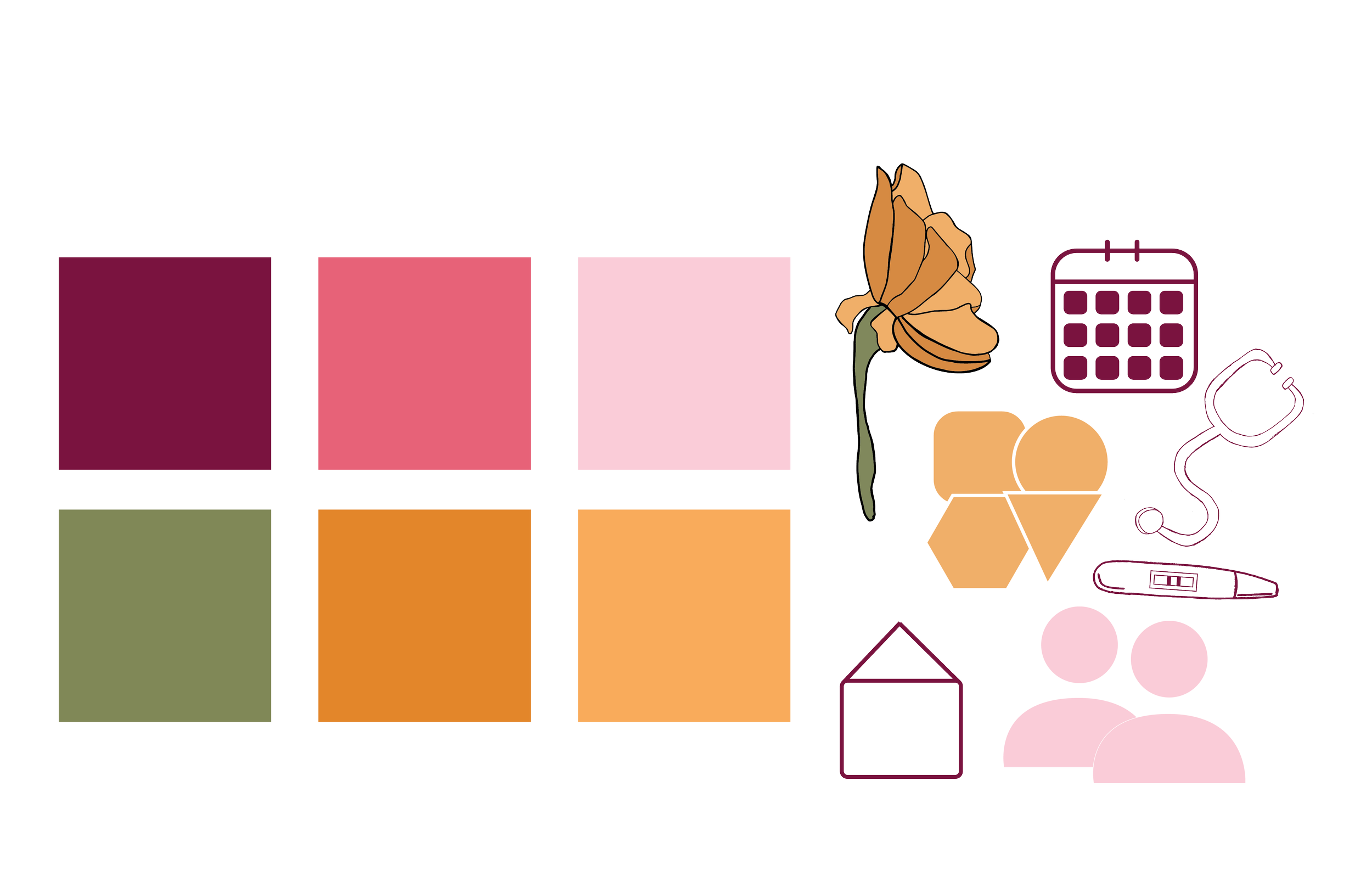

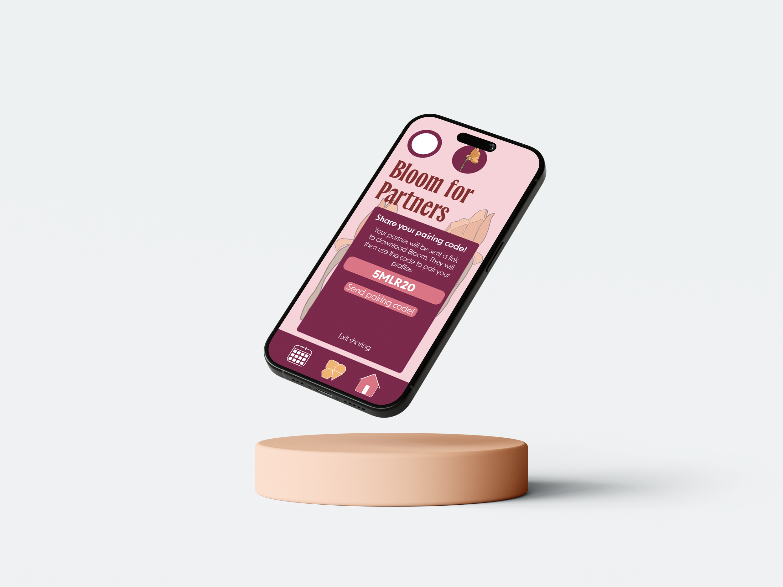
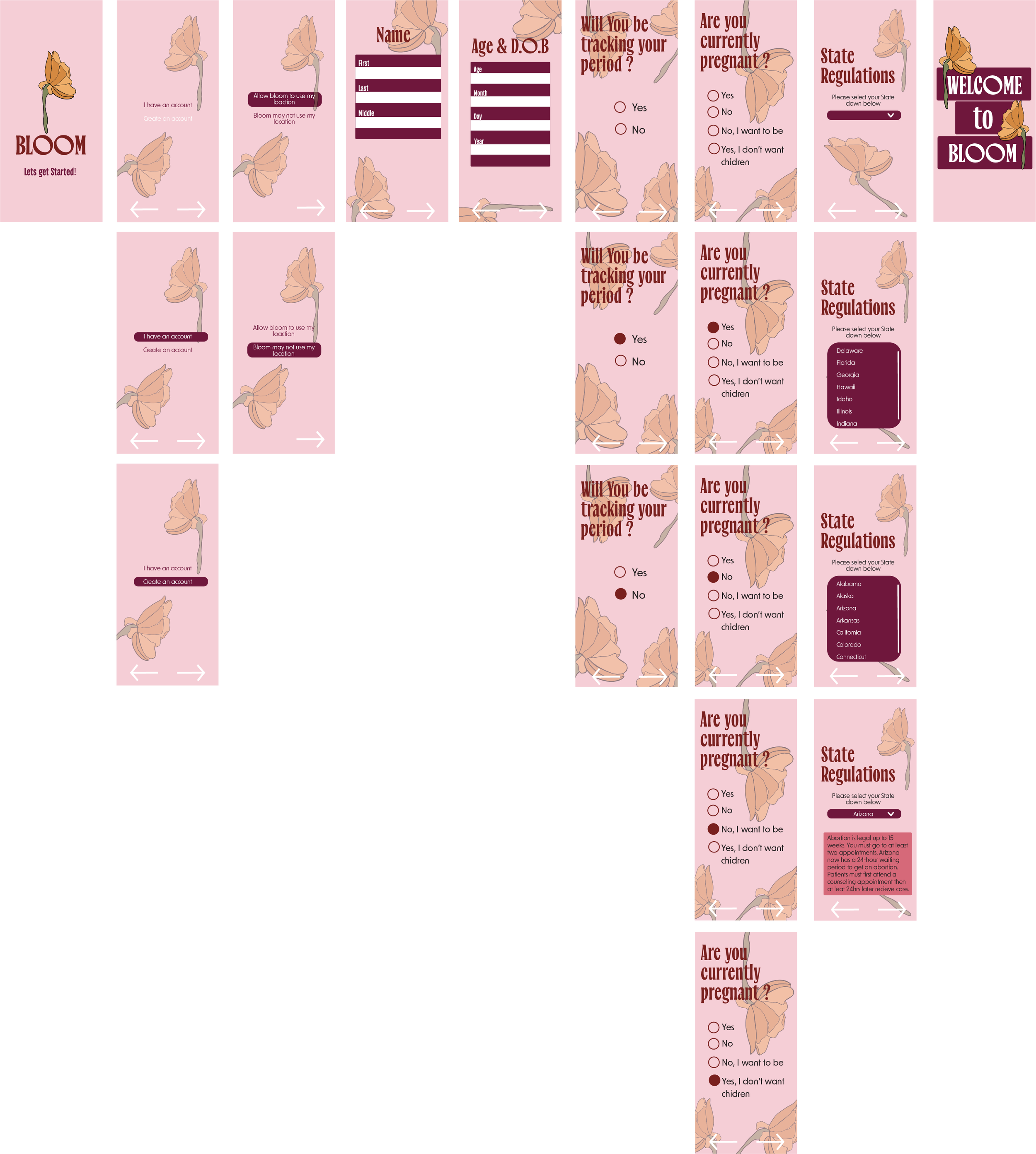
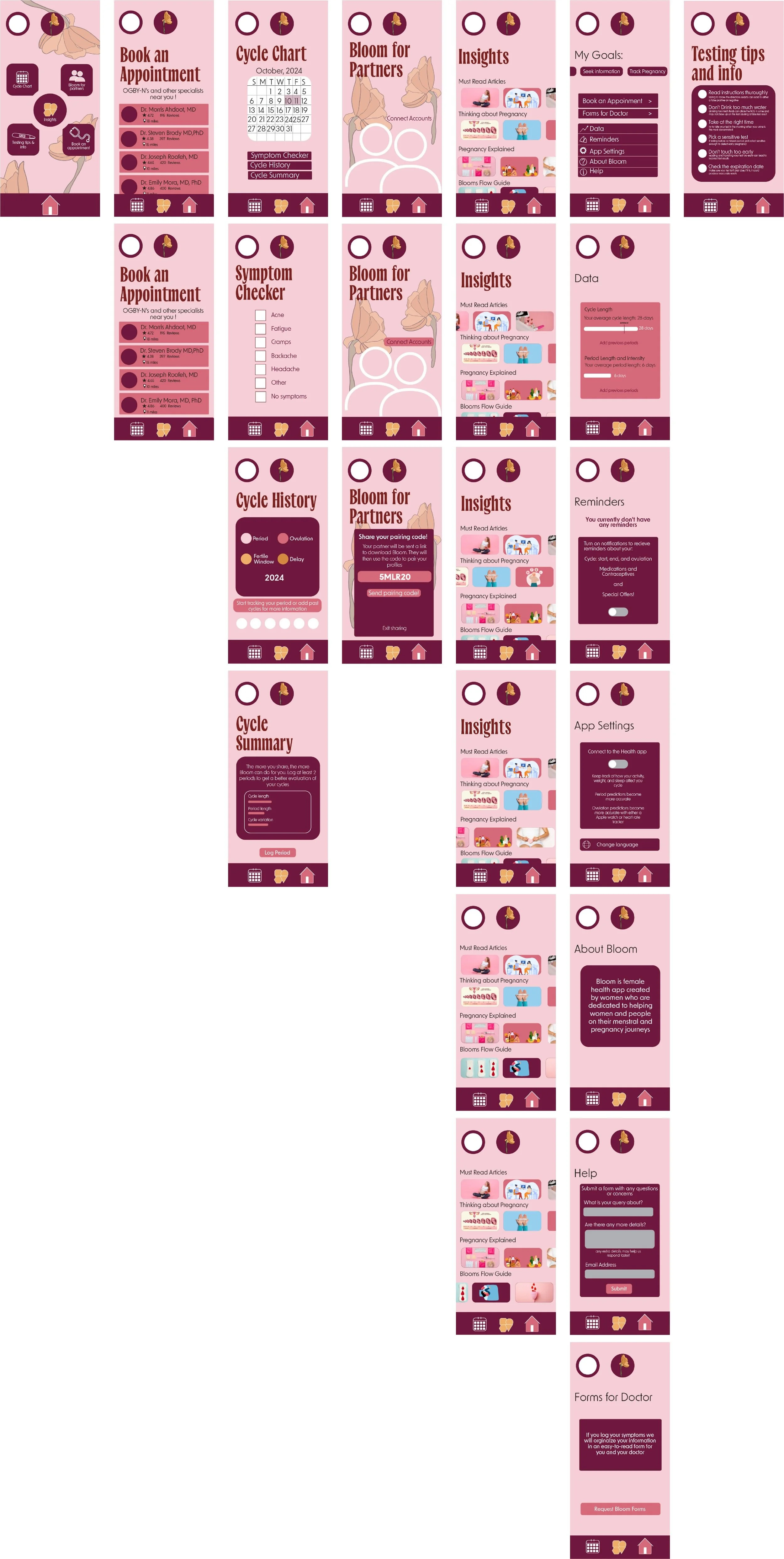
Every year women in the United States rely on about 20 million at home pregnancy tests, to give them life changing news. While it has been claimed that these tests are about 99% accurate, the reality is that over the last decade up to 5% of pregnancy tests are showing up with false positives. The at home pregnancy test also fails to provide any further action to be taken after receiving the result. To help combat the problem of taking the test incorrectly, I have created a step by step page on the app that addresses what should and should not be happening when taking a pregnancy test. I would also aim to help fix the problem of not having following steps and/or advice by creating pages that go into the different options the user could select while on the app. For the palette of this app I choose a pink palette that would reflect the femininity of the pregnancy tests and the consumers using the app, while also deciding on the flower as the logo in collaboration with the title Bloom celebrating the beauty of all woman’s health.