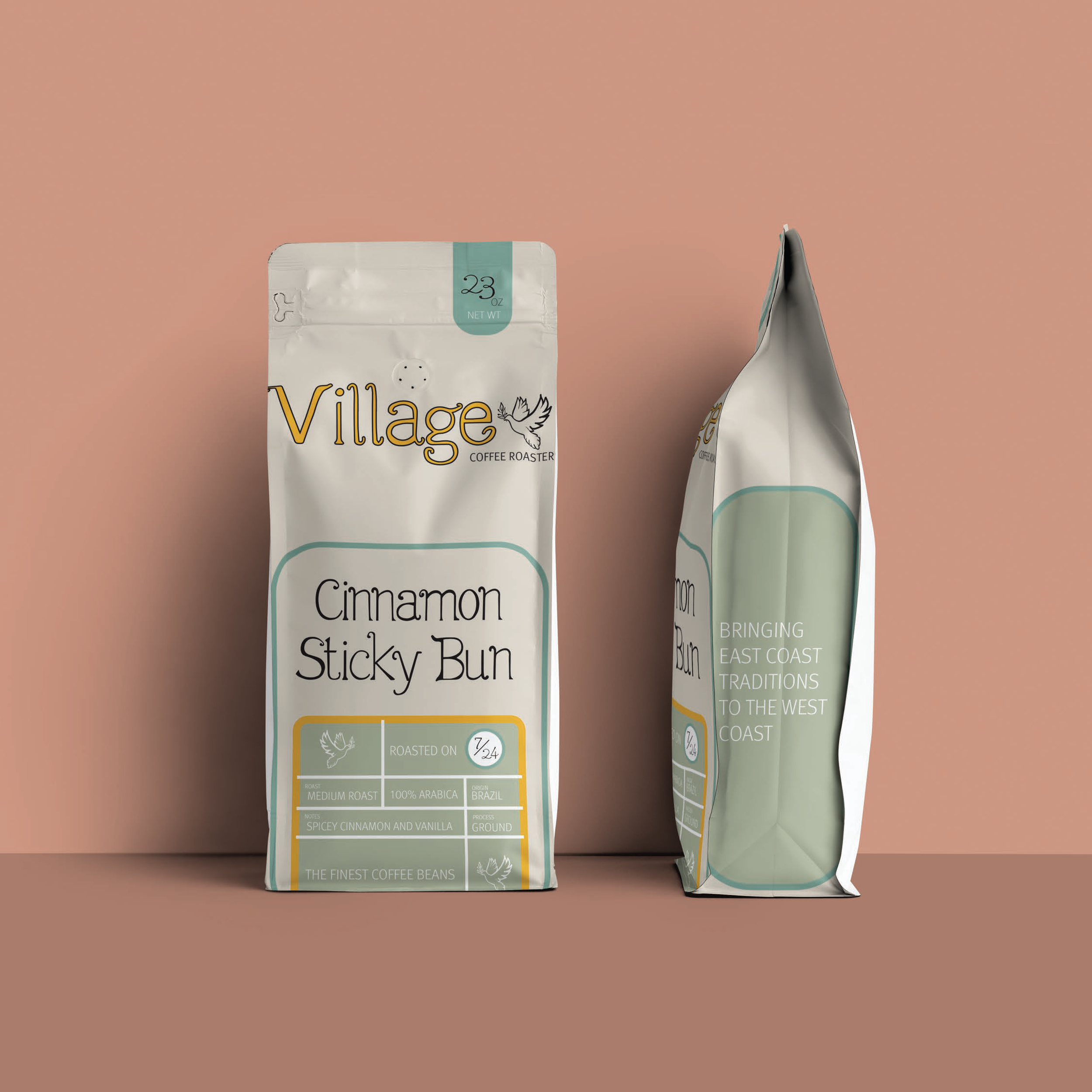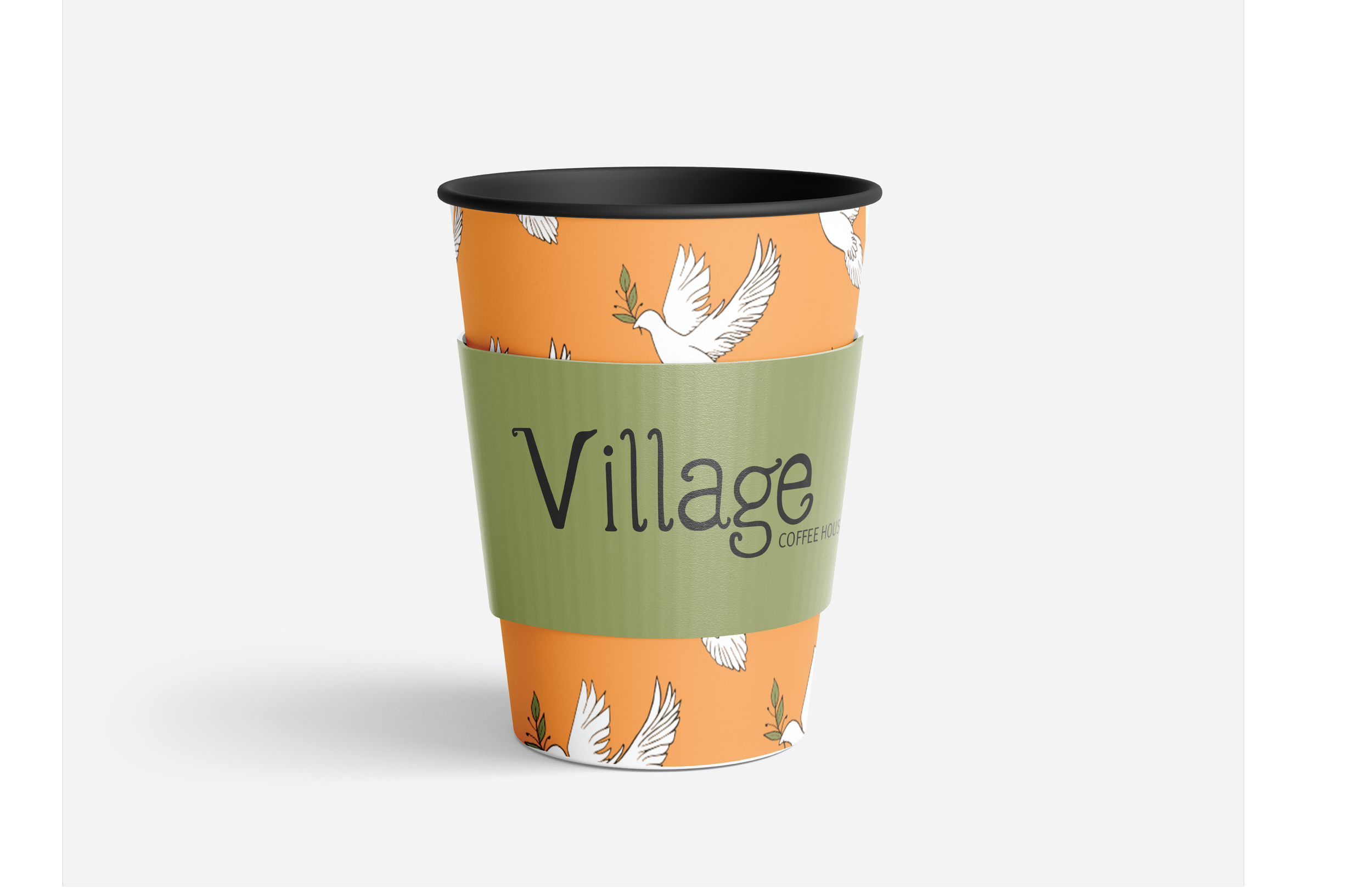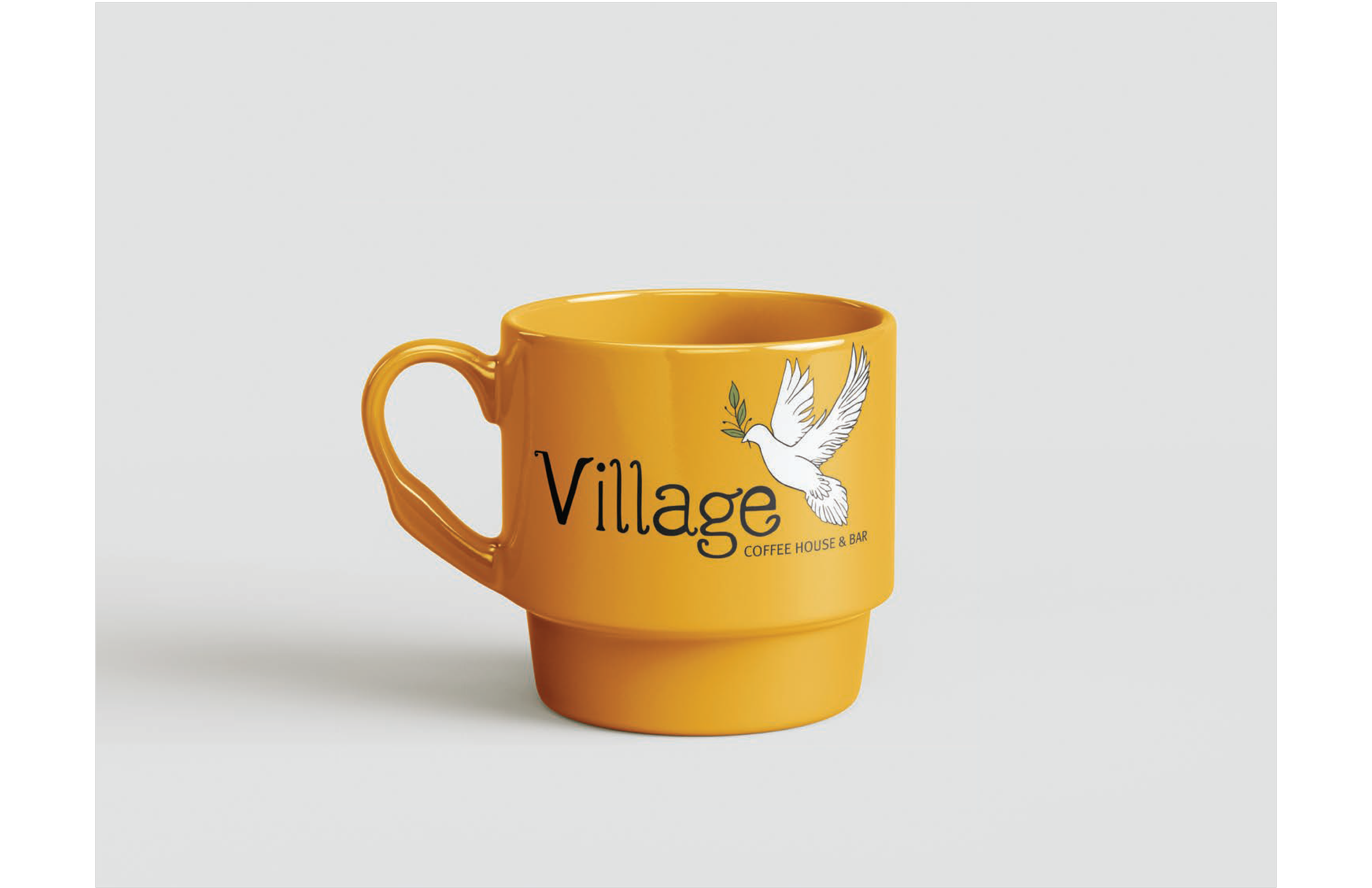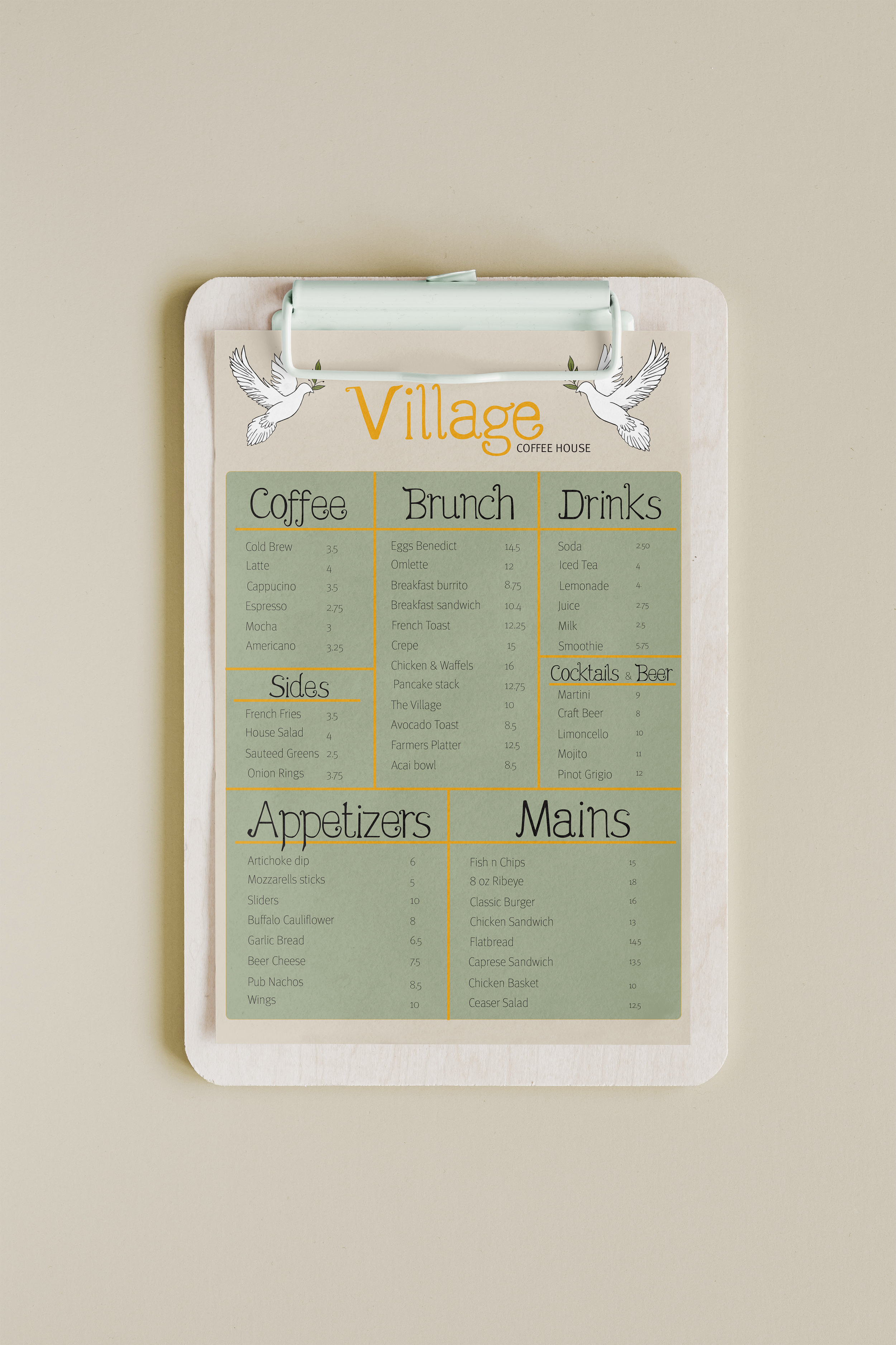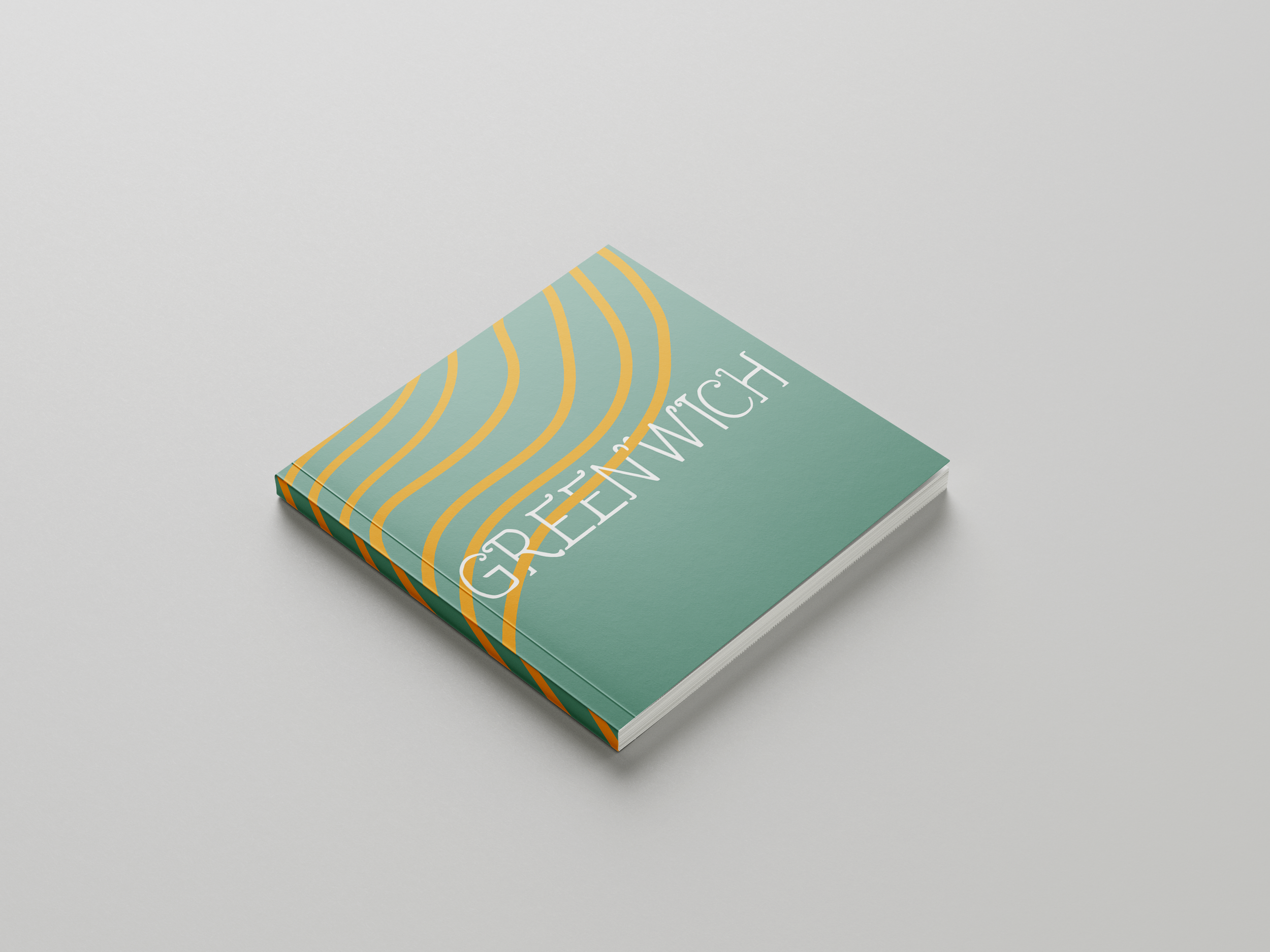
Project Brief
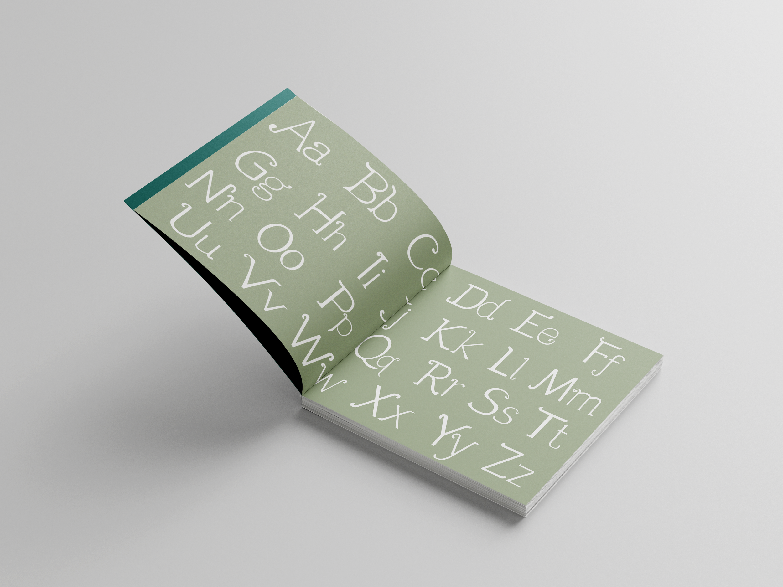
For this project, I was assigned the task of creating a new brand identity system and typeface based off of a music genre and typeface randomly selected for me. The genre assigned to me was Folk music alongside Meta by Erik Spiekermann. Using Meta as my foundation, I created my own custom font Greenwich that is used for the logo, display and headline type for the Cafe’s branding, as well as the specimen book showcasing my hand rendered typeface.

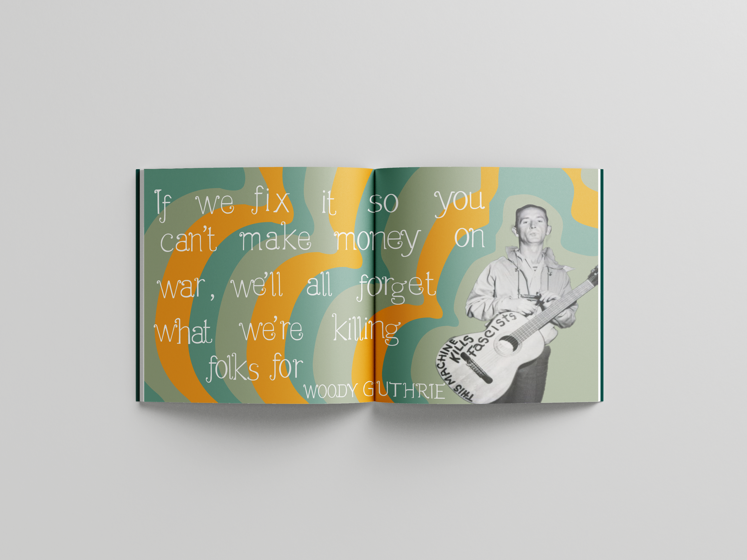
Folk music, a type of traditional and typically rural music, was passed down through families and other small social groups. Folk music, like folk literature, lived through oral tradition, taught through hearing rather than reading. Folk music varies from culture to culture, but it is most often associated as a genre of music of Europe and the Americas. From its beginnings, folk music has been the sound of the working class, rarely getting commercial success. Ranging in topic from work, war, satire, politics and love, Folk has consistently been a genre of music anyone could listen to. In the 1930’s, folk music had a resurgence as the stock market crashed leaving millions of the American work force without jobs. Woody Guthrie, a worker who had been laid off, moved from the dust bowl to California. There he would write hundreds of songs from 1930 until his death in 1967. Folk music once again had a revival durning the 60’s. The revival was brought on by the Civil Rights Movement and the Vietnam War. Folk singers would gather in coffee shops and at hootenannies in cities like New York and San Francisco. The musicians were offered political commentary while declaring powerful promises for change.
Folk Music Background
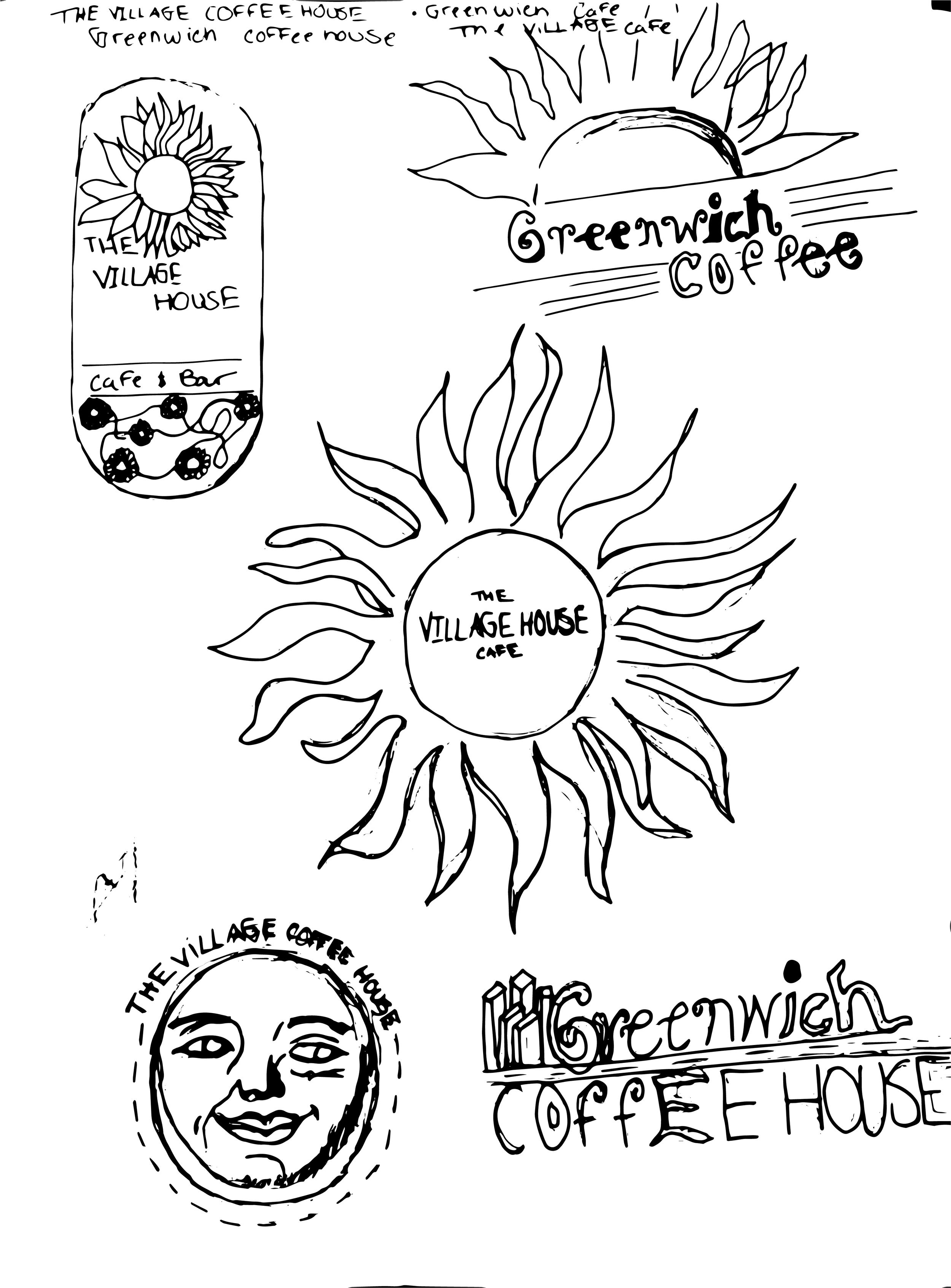
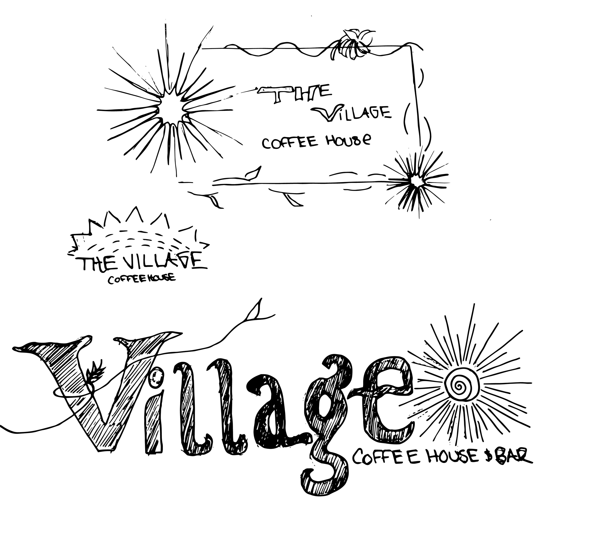
Getting to this iteration I first hand drew my font on tracing paper, that had been layered over the meta pro thin font. From there I continued on with three different directions. After exploring the options and editing two that had ended with a more of a serif feel, I started on this final iteration. To create this font, I first worked with my own sketches in procreate, then transferred them into illustrator, where I refined the type with the pen tool.
A Hand Drawn Typeface

Specimen Book


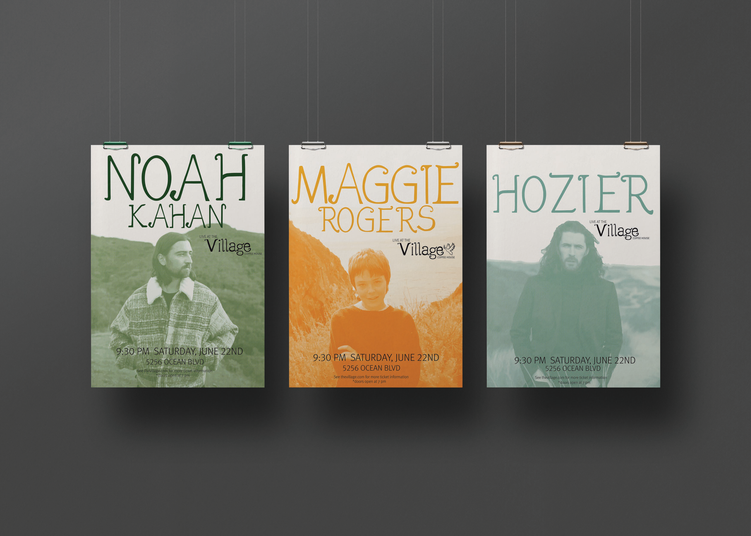
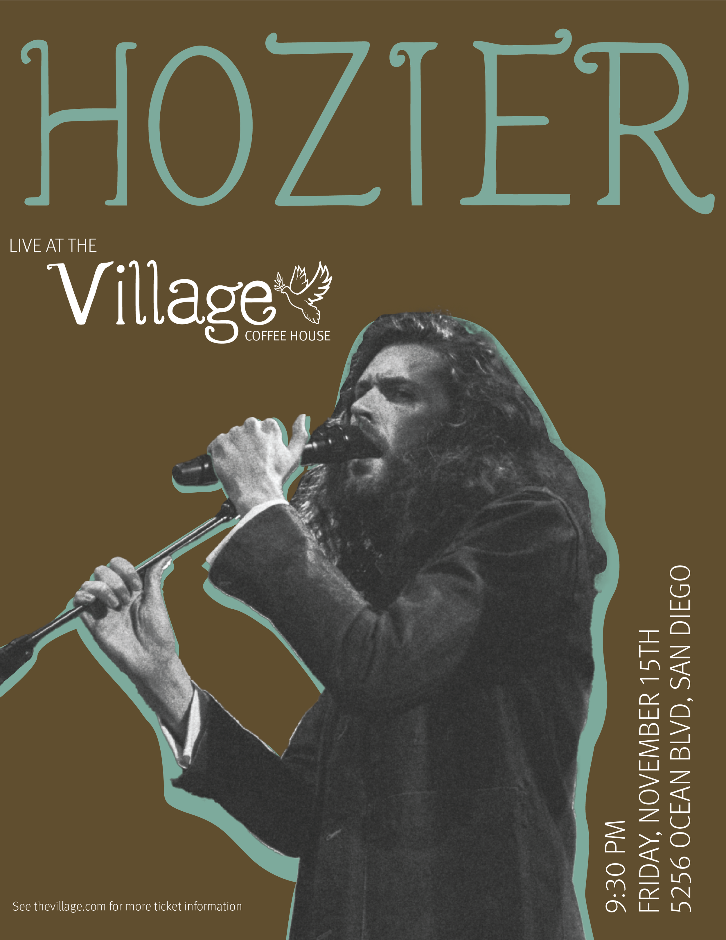
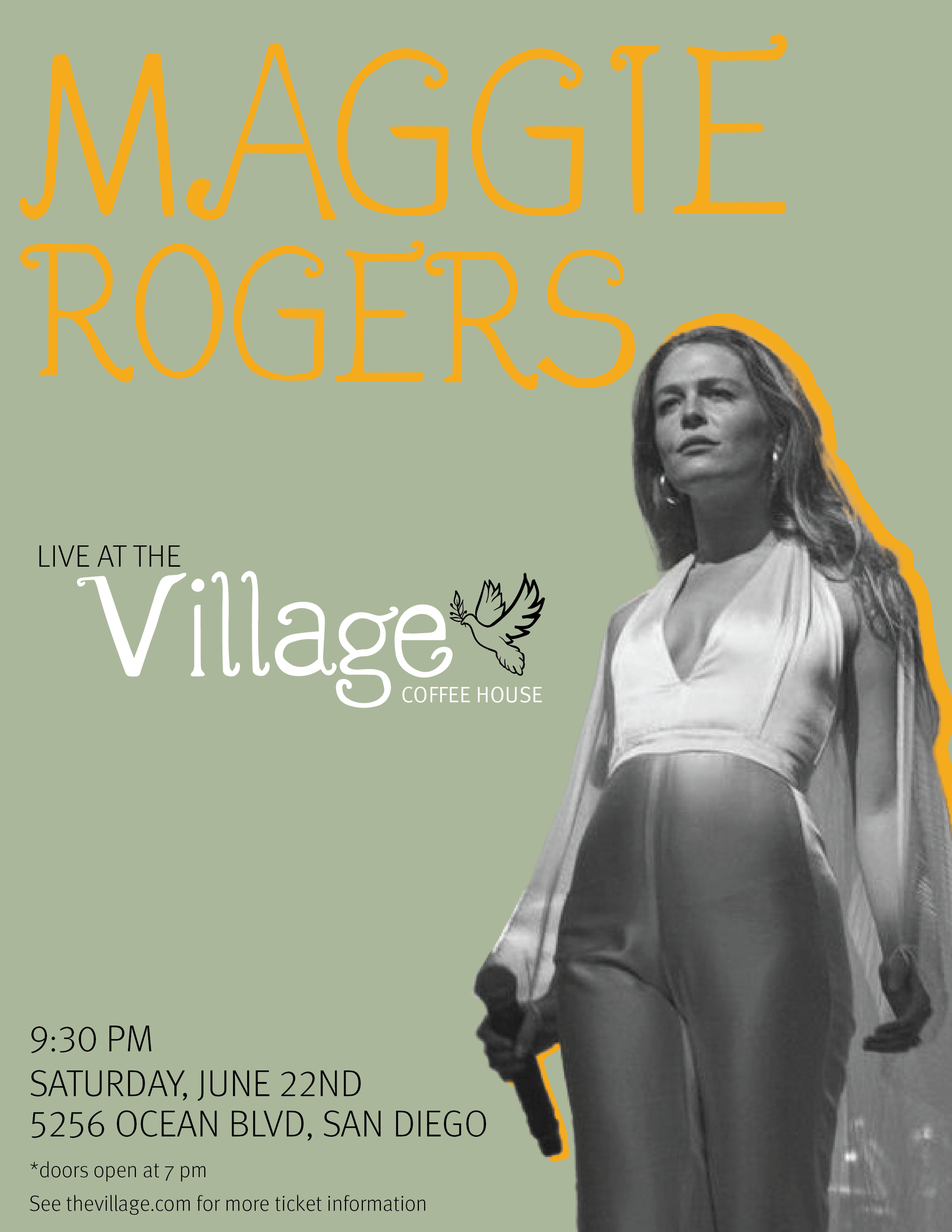
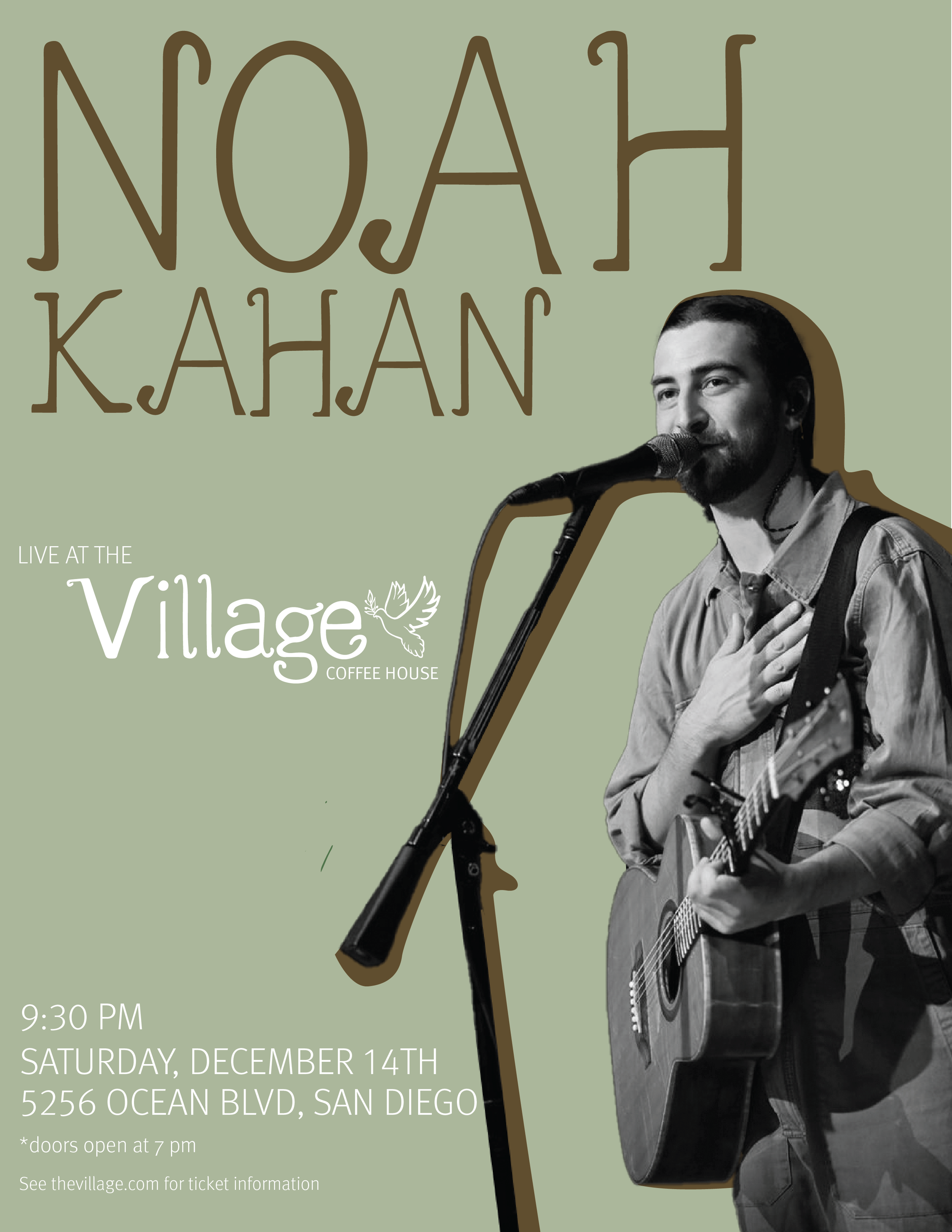
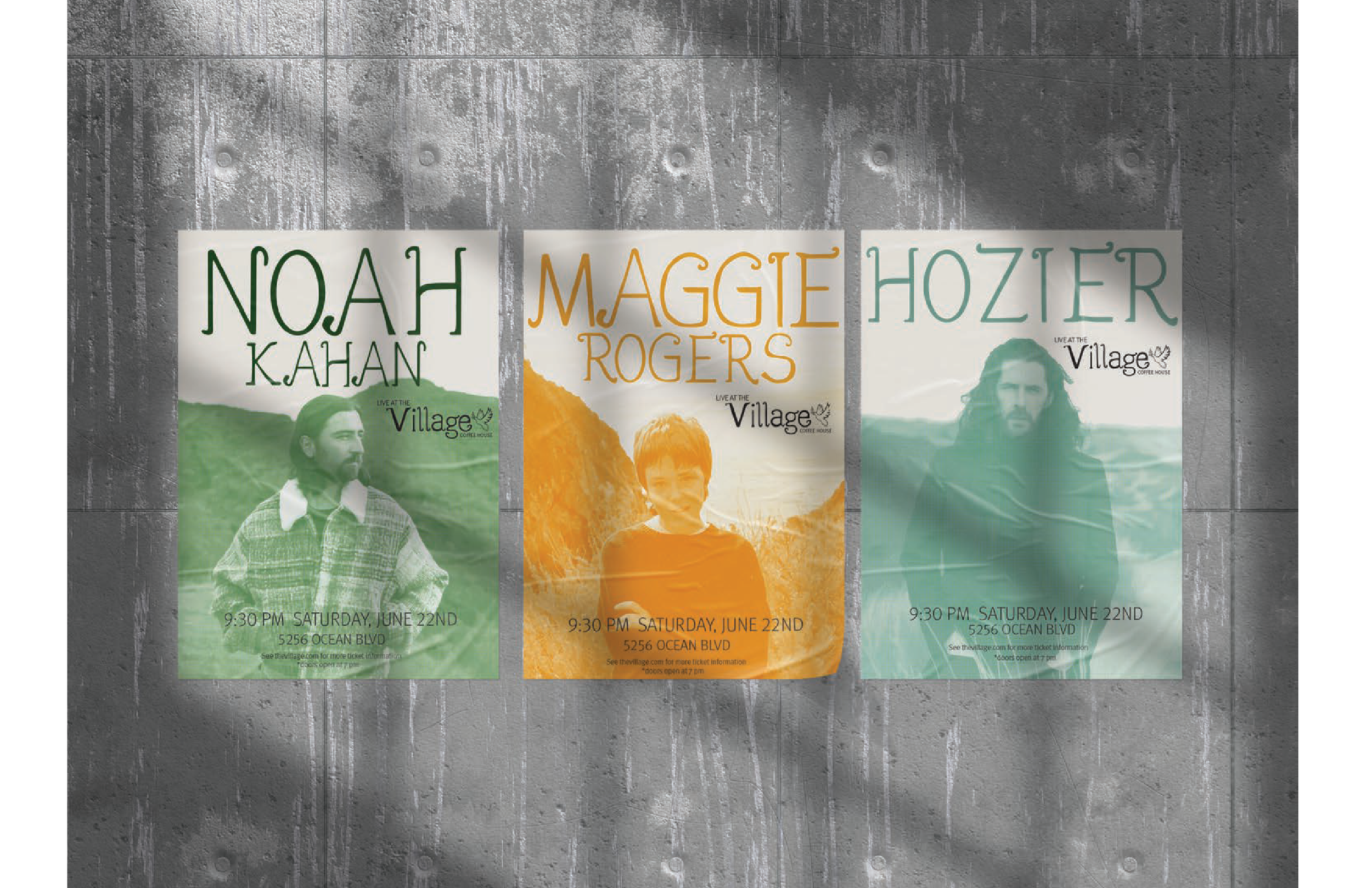
When working on the posters for this project, I first was unsure of how to incorporate the images of the artists. In my first iterations I used photoshop to cut out silhouettes of the artists with a colored shadow behind them differentiating the space between the background. Still not satisfied with the results, I opted for a simpler version that Focused more on my hand drawn typeface while still showcasing the artists in a classic halftone filter using the branding colors, that are reminiscent of the folk genre.